

DACO logo sketches and ideation
We began by evolving DACO’s logo into a cleaner, more contemporary mark that streamlined their visual identity while honoring the equity built over decades.

When DACO Corporation—a trusted provider of material handling and packaging solutions in the Pacific Northwest since 1972—approached us in celebration of their 50th anniversary, they were ready for a full brand evolution. At the same time, they contracted us to modernize their logo and redesign their website, ensuring both reflected the company’s legacy and forward momentum.
We began by evolving DACO’s logo into a cleaner, more contemporary mark that streamlined their visual identity while honoring the equity built over decades.
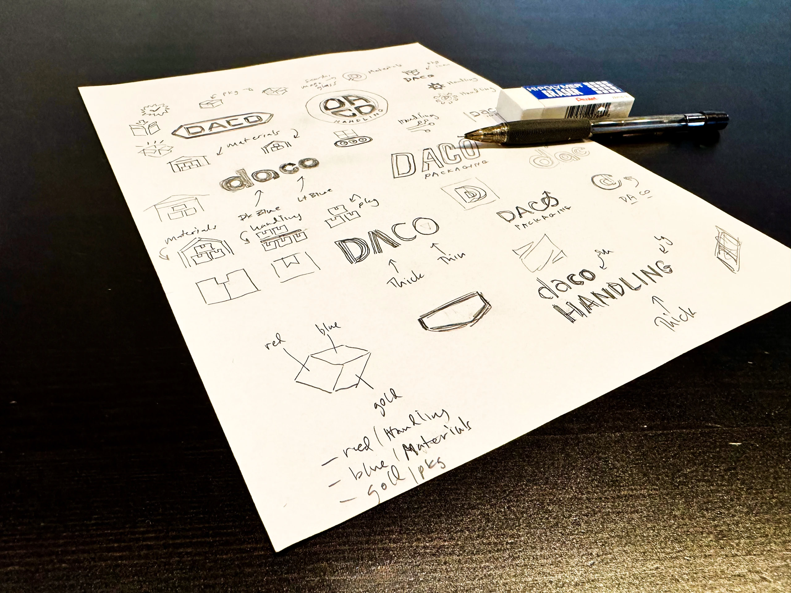
DACO logo sketches and ideation
The final revised DACO logo
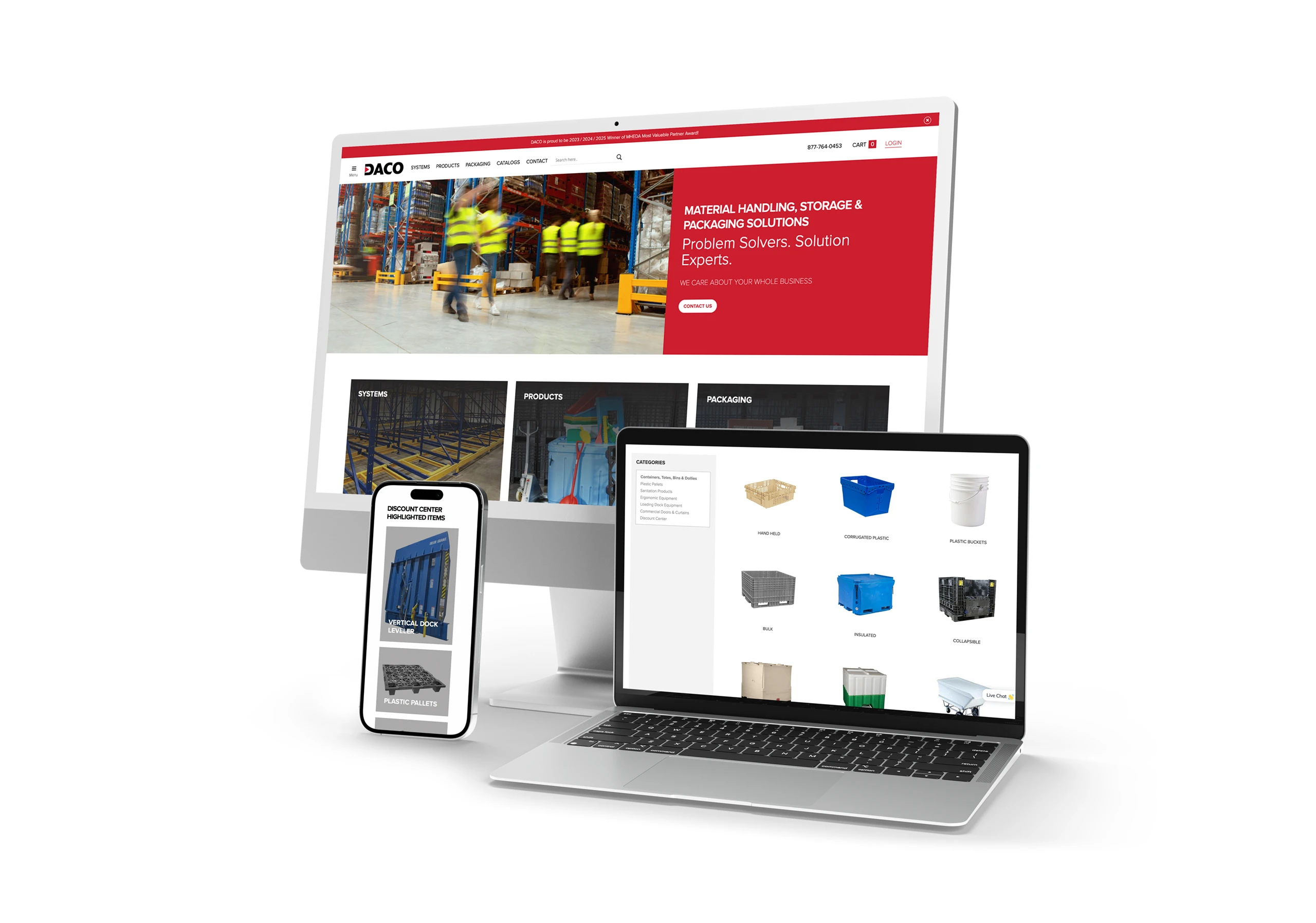
When we first began to tackle the redesign of their website, it was immediately clear: this wasn’t just a facelift. It was a full-scale rebuild from the ground up. Over the course of more than a year, our small but dedicated team tackled a project that touched every corner of the site—from restructuring the product taxonomy and integrating thousands of SKUs, to developing a user experience that could support both engineers and first-time buyers. The scale and specificity of the content required deep strategic planning. We worked closely with DACO’s internal team to ensure that product categories, specs, documentation, and lead capture tools all worked in concert to serve a range of customer needs. Design-wise, we brought a modern, clean aesthetic to the interface—prioritizing clarity, trust, and accessibility. Behind the scenes, we engineered a backend system flexible enough to handle frequent product updates and scalable enough to grow with DACO’s expanding offerings.